Family and duo memberhips
Launching new products for Natuurmonumenten.
What I did
UX design
Partners
iO (development)
PuurPXL (visual design)
Client
Natuurmonumenten
Launching new products for Natuurmonumenten.
UX design
iO (development)
PuurPXL (visual design)
Natuurmonumenten
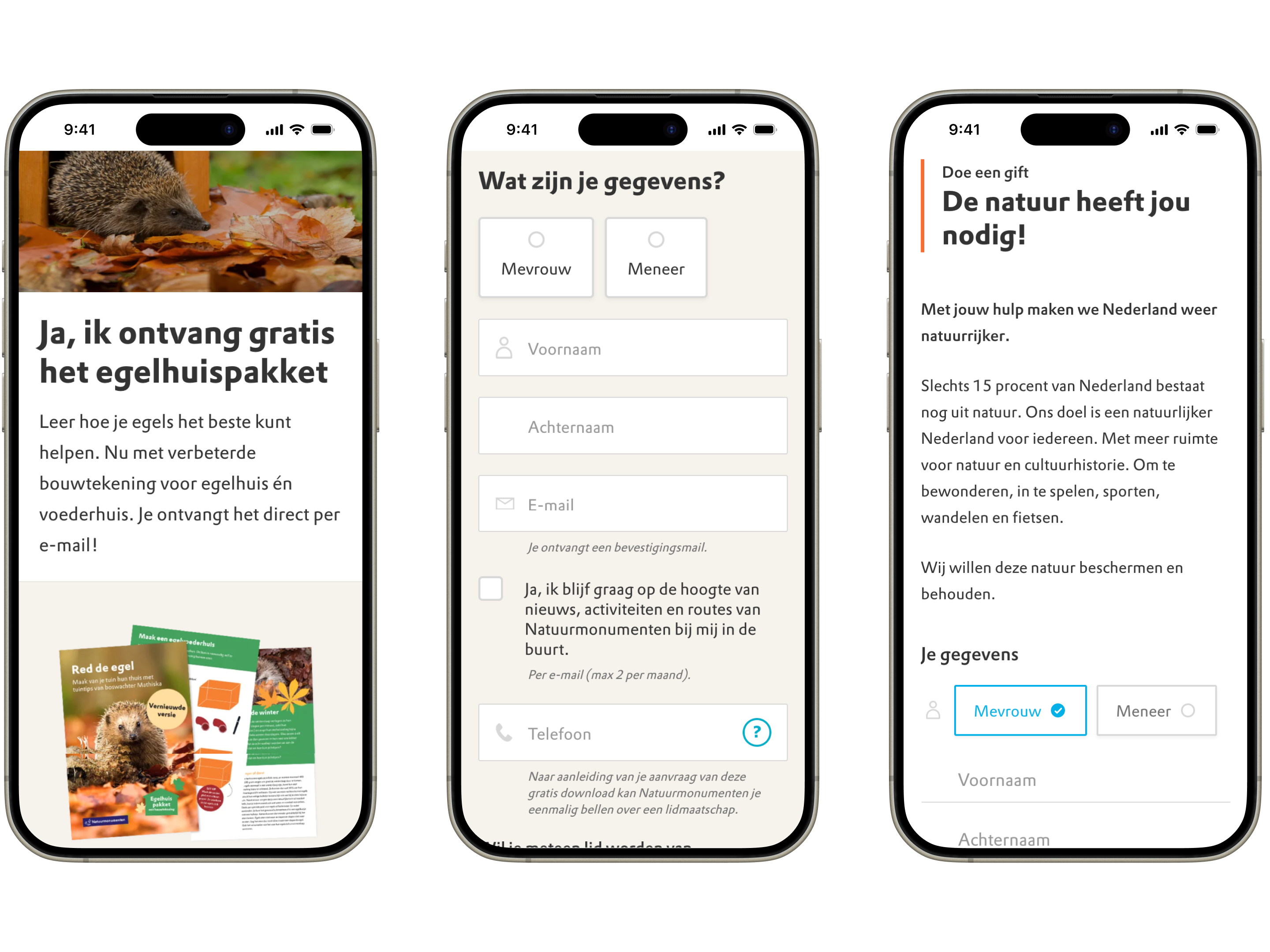
Natuurmonumenten uses forms to convert visitors into leads, donors and members. 80% of the traffic on these forms are on mobile devices. But the design and UX was not optimized for mobile usage, indicating that there was an opportunity.
Do i have the data to back this up? conversion mobile vs desktop bijvoorbeeld?
To improve form conversion on mobile devices by optimizing their usability and design.

Natuurmonumenten is the leading nature preservation non-profit in the Netherlands. With over 922.000 members they protect more than 110.000 acres of nature.
I performed an expert review of the forms, to list all the current issues.
We found that 80% of the form usage was on mobile devices.
Recommendation: optimizing for mobile usage is a must, since the majority of users visit the forms on a mobile device.
Form fields, radio buttons, and submit buttons are too small on mobile, making it hard to interact with them.
Recommendation: increase size of fields and buttons so their touch target is increased. Test other designs for radiobuttons and checkboxes. Limit the usage of dropdown menu's since they have complex interaction patterns on mobile.
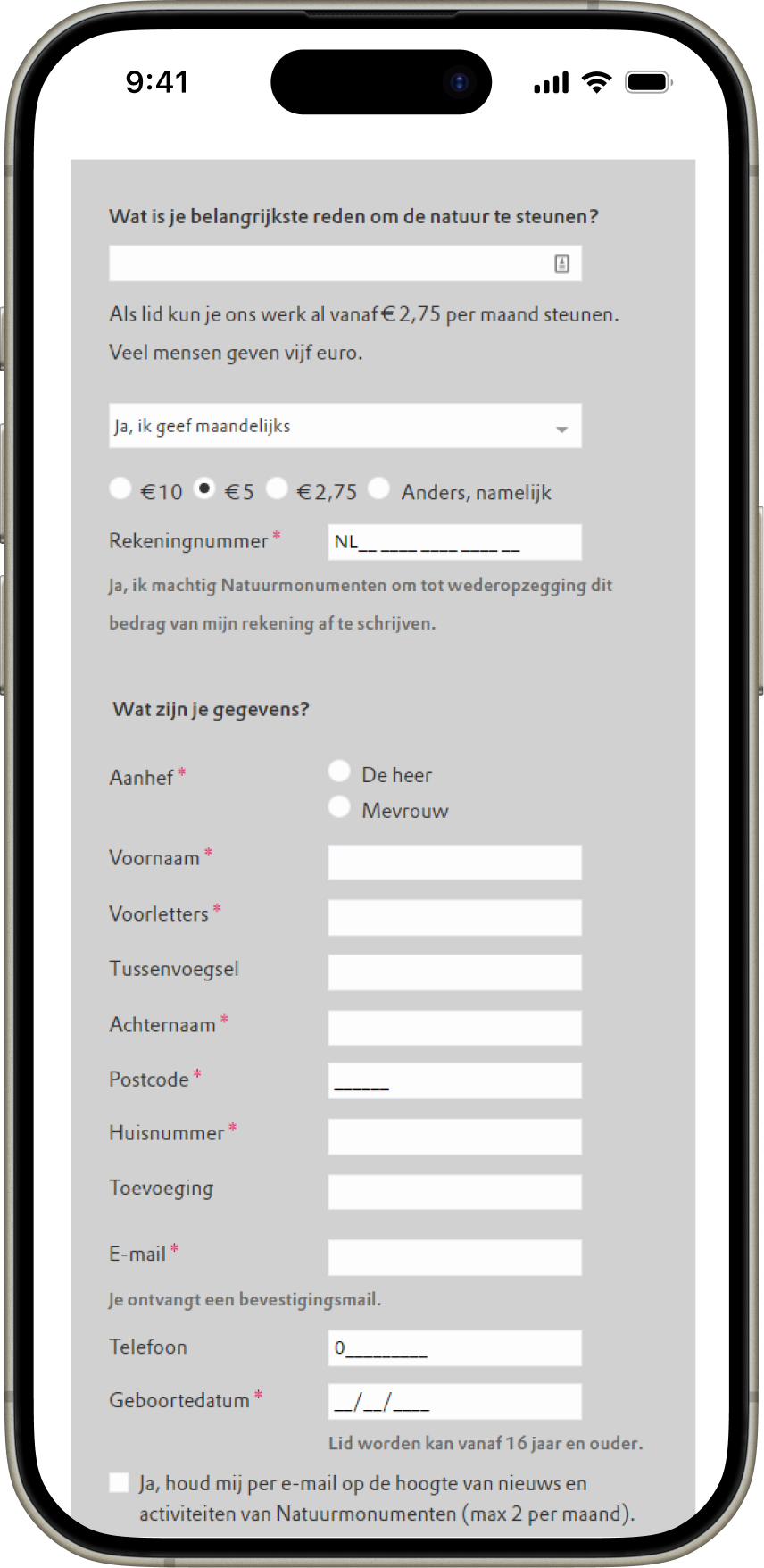
Forms started with the "big" question: how much money do you want to donate. Then continued with easy questions like name.
Recommendation: test if reversing this order helps conversion.
There are a lot of text fields to fill out. This makes the form intimidating.
Recommendation: remove fields if possible to make the form easier to understand.
I made wireframes of possible design directions for the form and the form pages.


The first iteration was percieved as too busy, because of the blob shape and the square image. I also improved the destinction between the primary / secondary button and added some playful elements around the photo that add depth to the block.
✔ Conversion
Conversion for the membership form increased by xx %


